Scatterplots. You may not know them by name, but if you spend more than 10 minutes online you’ll find them everywhere. They’re popular in news articles, in the data science community, and, perhaps most crucially, for Internet memes about the digestive quality of pancakes.

By depicting data as a mass of points across two axes, scatterplots are effective in visualizing trends, correlations and anomalies. But using them for large datasets often leads to overlapping dots that make them more or less unreadable.
Researchers from MIT’s Computer Science and Artificial Intelligence Laboratory (CSAIL) say they’ve solved this with a new open-source system that makes it possible to create interactive scatterplots based on large-scale datasets that have upwards of billions of distinct data points.
Called “Kyrix-S,” the system has an interface that allows users to pan, zoom and jump around a scatterplot as if they were looking at directions on Google Maps. Whereas other systems developed for large datasets often focus on very specific applications, Kyrix-S is generalizable enough to work for a wide range of visualization styles, including heatmaps, pie charts and radar-style graphics. (The team showed that the system allows users to create visualizations with 800 percent less code compared to a similar state-of-the-art authoring system.)
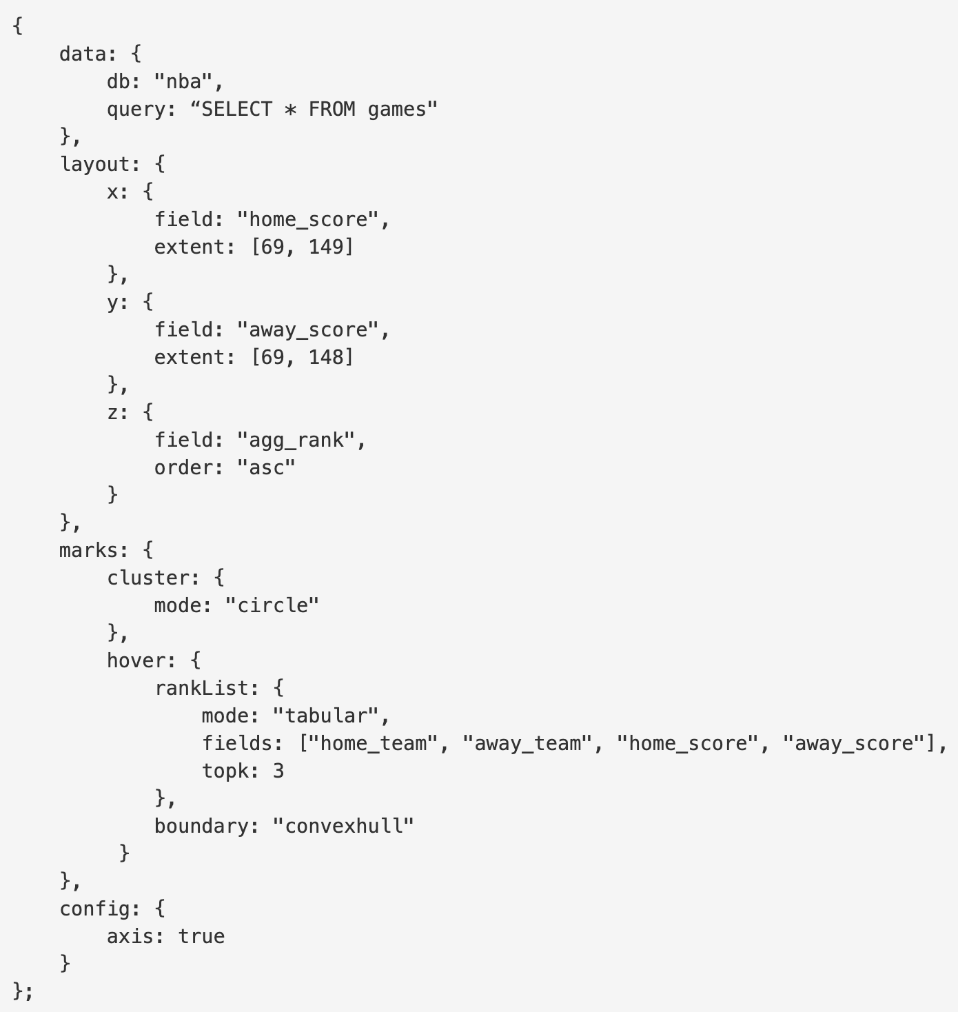
Users can produce a scatterplot by just writing a few dozen lines of JSON, a human-readable text format. For example, the system turns this:
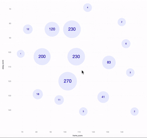
...into this:
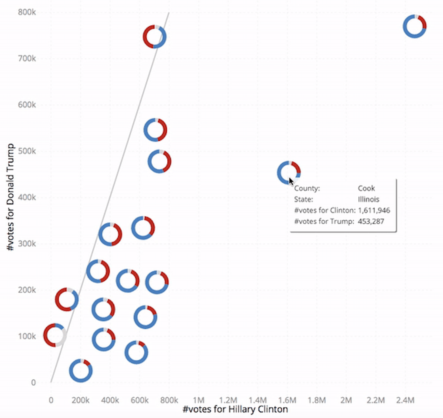
Lead developer Wenbo Tao, a PhD student at MIT CSAIL, gives the following example of a static New York Times scatterplot (below) that he says would improve by being made interactive via a system like Kyrix-S.
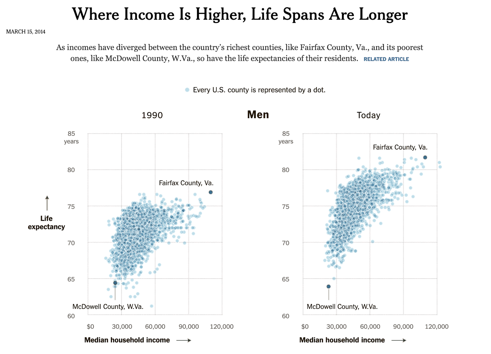
“In these scatterplots, you are able to see overall trends and outliers, but the overplotting and the static nature of the plot limit the user's ability to interact with the chart,” says Tao.
In contrast, Kyrix-S can produce a version (below) that puts data in several zoom levels, enabling interaction with each county. To avoid overplotting, Kyrix-S’ scatterplot also shows only the most important examples, like the most populous counties.
“As a visualization researcher I am constantly at the edge of data sizes that are possible to visualize, which forces me to summarize or partition my data to get any insights,” says Kristi Potter, a data visualization scientist at the National Renewable Energy Laboratory who was not involved in the research. “With Kyrix-S, it’s possible to use all of the data, providing much more confidence in visualizations of large-scale data.”
Kyrix-S is currently being used by Data Civilizer 2.0, a data integration platform developed at MIT. An earlier version was also employed to help Massachusetts General Hospital (MGH) analyze a massive brain activity dataset (EEG) that clocks in at 30 terabytes - the equivalent of more than 50,000 hours of digital music. (The goal of that study was to train a model that predicts seizures, given a series of 2-second EEG segments.)
Moving forward, the researchers will be adapting Kyrix-S to work as part of a graphical user interface. They also plan to add functionality so that the system can handle data that is being continuously updated.
Tao wrote a paper about Kyrix-S alongside MIT adjunct professor Mike Stonebraker, researchers Xinli Hou and Adam Sah, PhD graduate Leilani Battle and professor Remco Chang of Tufts University. It will be presented virtually at IEEE’s VIS data visualization conference October 25.